

A high converting law firm website does one job: turn the right visitor into a signed client before they bounce to the next firm on the SERP. That means a clear above-the-fold offer, mobile speed that does not punish Google Ads or Local Services traffic, trust signals that survive a skeptical scroll, and intake that actually answers. (Yes, I know you should be entering your .1s right now. This checklist is shorter than a status conference.)
The bottom line
Pass a five-second fold test. Ship mobile-first CTAs. Keep load time under three seconds. Use real photos and reviews above 4.0 stars. Wire forms and chat to a human path. Build practice pages for intent and state bar rules. Fix intake before you fund a redesign. Skip us if your Google Business Profile is still unclaimed or someone else still owns your domain.
Pass the five-second above-the-fold test
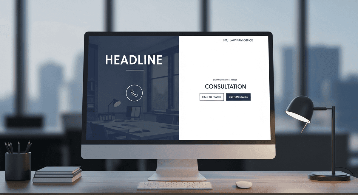
Open your homepage on a phone. Cover the rest of the screen with your hand. In five seconds, can a stranger tell who you help, where you practice, and how to call or book? If the answer is a poetic tagline and a stock courthouse, the fold fails. Conversion starts before the scroll.
Put the practice signal in the headline. Put a primary CTA and a click-to-call number where thumbs land. Save the firm history for below the fold. Paid traffic from Google Ads and Local Services Ads is expensive rent — sending it into a vague hero is how you fund opposing counsel's marketing instead of your own retainers.
Rule of thumb: one primary action above the fold. Not a carousel of six competing buttons. Not a video that autoplays over the phone number. Clarity beats clever. For how custom builds structure that first viewport without template sludge, see custom law firm websites.
Mobile-first is not optional
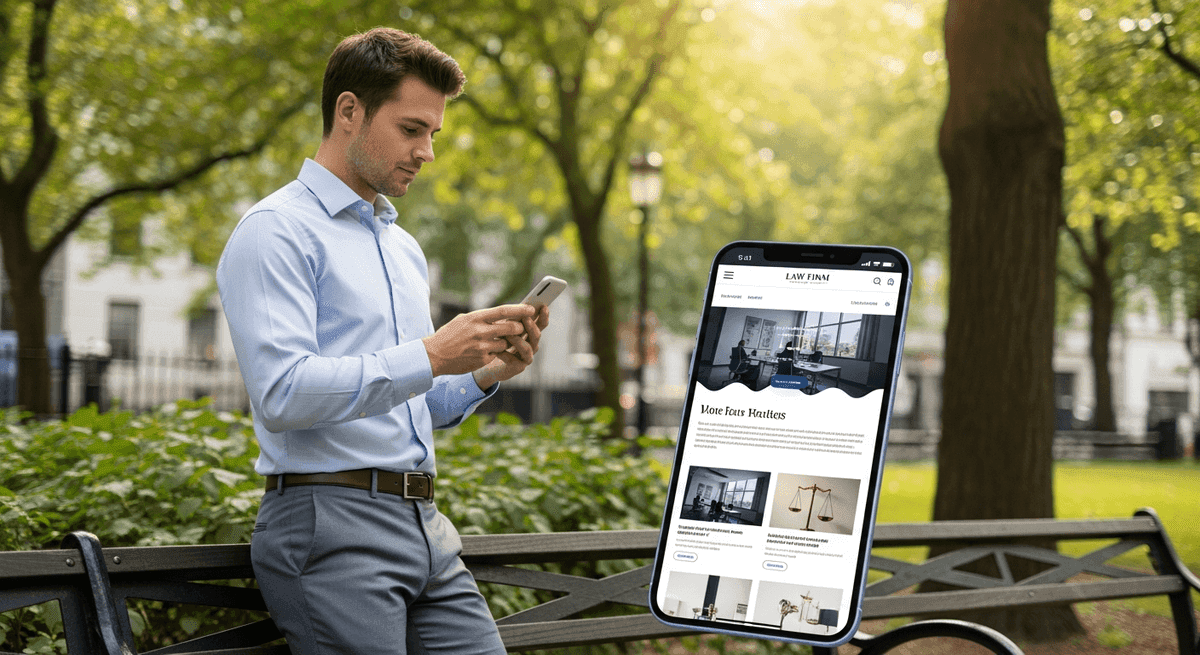
Google indexes mobile-first. Your injured, divorced, or arrested prospect is already on a phone in a parking lot. "Mobile-friendly" that shrinks a desktop layout until buttons are postage stamps is not conversion design. It is a desktop site wearing a disguise.
Tap targets need room. Sticky call bars help when they do not cover the form submit button. Practice-area pages should read cleanly without pinch-zooming the fee disclaimer into oblivion. Nine times out of ten, the firm that "gets traffic but no calls" has a mobile CTA problem, not a branding problem.
If the site was built when flip phones still had cultural relevance and it is not flawlessly responsive, do not buy more SEO. Rebuild. Pouring budget into a broken mobile lobby is billable hours set on fire. Design patterns that hold up on small screens are covered in best law firm website design.
Speed that does not lose the retainer

Let's look at the math. A slow website — loading in over three seconds — causes a 40% bounce rate. That is four out of ten prospective clients walking out of your digital lobby before they see counsel's name. Core Web Vitals are not a developer hobby. They are the scorecard for whether paid and organic traffic survives the first impression.
Nine out of ten slow firm sites share the same condition: digital plaque. A consultation widget. Then a chat bot. Then a 10MB bookshelf headshot. Over a couple of years the plaque narrows bandwidth until the page takes eight seconds on cellular. The algorithm hates it. Impatient prospects hit back and call the next lawyer on the list.
Compress images. Kill unused scripts. Host on infrastructure that does not nap during Monday intake spikes. Speed work is conversion work. If you are mid- redesign and worried about rankings, pair the rebuild with a migration plan — how to redesign a law firm website without losing SEO exists for that exact panic.
Trust signals that survive a skeptical scroll

Here is the opinion we will not soften: stock photography is killing your conversion rate. Smiling models pointing at legal pads in front of pristine bookshelves look fake because they are. Clients want your conference room, your staff, and your face. Real, slightly imperfect photos convert better than glossy stock. Hire people, not a gavel CDN.
Reviews matter with a hard floor. If your Google rating drops below 4.0 stars, online conversion rates can plummet by up to 60%. Fix the client experience and ask for reviews after resolutions before you buy more ads. Attorney bios with bar admissions, practice focus, and a human paragraph beat "decades of combined experience" brochure copy every time.
Show credentials that your state bar allows you to show. Skip the fake award badges that every template ships with. Trust is specific. Vague authority claims have less credibility than a sovereign citizen filing. Put proof near the CTA — not buried on a testimonials page nobody opens.
CTAs and intake that actually answer

Marketing's job is to make the phone ring or the form submit. If the front desk puts the prospect on hold for ten minutes or the after-hours chat sits unread until Tuesday, the marketing budget is being set on fire. Audit intake before you audit the logo.
Use specific CTAs. Collect only the fields you need. Encrypt anything that touches case facts — a generic contact widget dumping privilege into cleartext email is a disciplinary nightmare waiting for a Monday. If Clio, MyCase, or your practice stack cannot accept a clean online inquiry, the bottleneck is operations, not the homepage gradient.
We once got a Monday morning panic from a busy PI practice whose intake form broke over a weekend. Dozens of high-value inquiries vanished into a dead API. The fix took under two hours once someone owned the connection. Conversion is not a button color test when the pipe is burst. Monitor forms like you monitor filing deadlines.
Practice pages built for intent and the bar
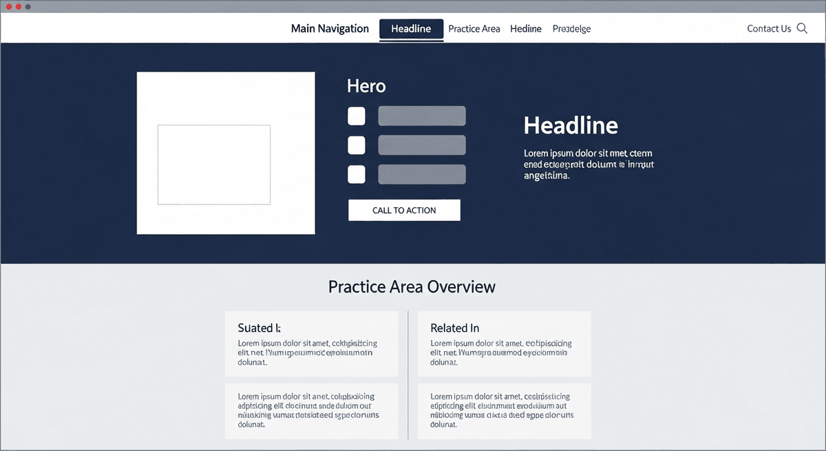
Thin practice pages that say "we handle family law" and link to a contact form do not convert search intent. Write for the problem the prospect typed: custody modification, DUI first offense, rear-end collision with insurance delay. Structure with clear headings, proof, process, and a CTA that matches the urgency.
Follow your state bar's advertising rules on claims, testimonials, and specialization language. A high converting law firm website that violates advertising ethics is not a win — it is a complaint waiting to happen. Pair conversion copy with disclaimers that are honest, not theater.
Accessibility belongs on this checklist too. Unlabeled fields and keyboard traps lose clients and invite ADA demand letters. Treat WCAG AA as conversion hygiene. The full remediation path is in our ADA compliance for law firm websites guide. For federal context on digital access expectations, see the Department of Justice web guidance and the W3C WCAG overview.
When not to hire us yet

Before spending five figures on a new site, claim and complete your Google Business Profile. It drives a huge share of local client traffic and it is free. We have talked attorneys out of retainers when the only blocker was an unverified postcard on the receptionist's desk. Do the free work first.
Do not hire a web team — us included — if intake is the real leak. A gorgeous rebuild will not save a front desk that never returns calls. Do not hire anyone for a full project if your last agency still holds domain credentials hostage. Resolve ownership first. And if you want a prettier homepage with no practice architecture, no mobile CTAs, and no willingness to replace stock photos, you need a brochure designer, not a conversion partner.
Generic agencies never turn that money down. We will. Book a discovery call when you want a flat-fee scope against this checklist — not a fear pitch and a twelve-month lock-in.
Straight answers

What makes a high converting law firm website?
A high converting law firm website makes the next step obvious in five seconds, loads fast on mobile, shows real trust signals, and routes inquiries into a working intake path. Pretty design without a clear phone number, CTA, and practice signal is a brochure — not a conversion system.
What should be above the fold on a law firm website?
Who you help, where you practice, a primary call-to-action, and a click-to-call phone number. Skip the abstract mission statement and the stock gavel. If a stressed prospect cannot tell what you do and how to reach you without scrolling, the fold fails.
How fast should a law firm website load?
Aim for under three seconds on a mid-range phone on cellular. A site that loads over three seconds drives a 40% bounce rate — four out of ten prospective clients leave your digital lobby. Core Web Vitals are the practical scorecard Google and impatient clients both use.
Do stock photos hurt law firm website conversion?
Usually yes. Generic models pointing at legal pads look fake because they are. Real conference rooms, real staff, and real attorney faces convert better than glossy stock — even when the iPhone shot is slightly imperfect. Clients hire people, not stock libraries.
What CTAs work best on attorney websites?
Specific, low-friction actions: Call now, Request a consultation, or Start your case review. Vague buttons like Learn more waste paid traffic. Put one primary CTA above the fold and repeat it near practice-area proof and the footer — not twelve competing buttons.
Should law firm websites use live chat?
Only if a human or a tightly scoped after-hours workflow actually answers. An unread chat bubble is a broken receptionist with a typing indicator. Chat that dumps sensitive case facts into an unencrypted inbox is worse. Wire intake to your practice management stack or do not install the widget.
How often should a law firm redesign its website?
If the site is five or more years old and not flawlessly mobile-responsive, rebuild it. Do not pour SEO or Google Ads budget into a leaking lobby. Between rebuilds, run conversion audits on CTAs, speed, and intake — redesign is not the only lever.
Does ADA compliance affect website conversion?
Yes. Keyboard traps, unlabeled forms, and low contrast lose clients who use assistive tech — and they invite demand letters. Accessibility fixes often clean the same scripts and structure that improve speed and mobile conversion. Treat WCAG AA as part of the conversion checklist, not a separate vanity badge.
Ready for a straight answer on your site's conversion gaps?
We build U.S. law firm websites that pass this checklist — custom code, real intake paths, full asset ownership. Book a discovery call if you want a flat-fee scope, not a vanity redesign.
See flat-fee pricing · Back to blog
Go finish entering your time. We will help keep the digital lobby from leaking retainers.